Watercolours
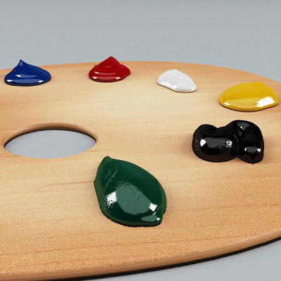
Had an interesting chat today with a friend. About colours. And emotions being like colours. She was saying that usually her's aren't the obvious primary coloured ones: the red, blue and yellow of anger, sadness and happiness. And they're not neat like the colours on this palette. Instead they're more subtle, like watercolours, and often run into each other making it difficult to name them.
For her, naming them helps. They still might look messy but in picking out the hues, they're less of a stress and a muddle. And it's easier to do something with them. So the purple into pink, instead of a vague bruise, becomes the hug of homesickness and fondness. And a reminder to send an email. And the wash of grey and biege is no longer a haze but the whisperings of tiredness and emptiness and a sign that rest, good friends and some wine are what's needed.


Comments
Post a Comment